Intended audience: leaders looking to win at the long game in a world that changes faster than many can adapt.
Note that AI was used to research workforce trends and latest statistics but the qualitative examples, analysis, and conclusions are my own.
I had an interesting conversation the other day about the future of creative work. The young man challenges his LinkedIn audience to think what would make someone stand out if everyone has the same access to the same AI tools. There were many comments praising human qualities and human creativity. However, this discourse pointed at a deeply flawed way we think about the nature of work, AI, creativity, and being human in an increasingly automated world.
It’s not “we have access to the same AI tools…” It’s “we have access to the same tools.” Just tools. Not AI. Full stop. This thought is older than AI. What made someone a resilient, creative, enthusiastic professional hasn’t changed. I’m worried that by chasing the next big thing many leaders forget, or set aside, something that we knew for a long time already.
Trillions for tools, pennies for people.
Don’t take my word for it. Here are some hard stats to support my thesis:
74% report increased IT & Software investment yet many still rely on manual, disconnected processes that create false sense of control until real-world demands expose the gaps [1][2]
Department of Education shows that British employers reduced their investment in staff training by £6bn in 2024, compared to 2022 levels [3] yet UK business investment in AI is due to raise by 40% [4]
While the industry celebrates AI’s potential to “unleash creativity” the reality on the ground is one of increasing “technostress” and “change exhaustion” [5]
It used to be that businesses invested in people. Now businesses invest in AI. The declines in training expenditure is particularly alarming given the pace of technological change and raising complexity of work. The result is a workforce that is being asked to do more with complex tools but with less institutional support for learning how to use them safely and strategically.
This led to the raise of “Shadow AI”, where employees, eager to be productive but left untrained, use unapproved AI tools at work. In the UK, 68% report that staff use shadow AI tools, which already led to data or IP exposure in 44% of businesses [6]. This phenomenon is the ultimate evidence of my hypothesis that businesses are forgetting to invest in people.
Signals that businesses are investing in humans again
There are tentative signals out there that people investment is on the rebound.
McKinsey Forward programme has a strong focus on adaptability, effective communication, relationship building, problem-solving, and digital and AI essentials. Notice how digital and AI essentials are at the bottom of the list.
Deloitte US released a report called “In a new era of work, winning organisations will build the human advantage,” that outlines the importance of building adaptability, resilience, and creativity. Those human skills. It’s funny that this report is dated 4 March and I’m writing this blog 10 days later. Great minds think alike!
IBM SkillsBuild is committed to training 2 million people in AI by the end of 2026. The program focuses on “essential workplace skills”, critical thinking, and integrity.
Lloyds Banking Group surveyed 1,200 UK companies and found that more firms are planning to invest in their staff (35%) than in AI technology itself (33%) in 2026.
Why is this important?
As a future designer I’m paid to think about long horizons. As a human-centred AI advocate I’m loving the shift towards investing in humans. As a service designer I want to design services that will support me in my old age. As a design leader sometimes tasked with building design capability and design thinking withing organisations, I sometimes want to scream:
“What AI? What adoption roadmap? Sweep your house first! You have managers who don’t know how to be managers! You have people that lack basic skills to do their jobs properly! Train them first, then we can talk about AI.”
It’s important because in a world that changes every five minutes, in a world where everyone has the same tools, the true differentiator will be human creativity.
Intended audience: design leaders working on increasing design maturity of their organisation and struggling to gain traction. In this article I’m reflecting on the last decade of building design capability and why we still struggle to “get a seat at a table.”
The theme of increasing design maturity has been following me around my entire career. From the very first UX project all I heard was about proving value and increasing maturity, getting a seat at the table, and making the organisation more customer focused. I spent several years in that role as a junior before leaving to build user research capability at another company. It is then I really came to appreciate “the struggle.” Herding cats, more like.
Now, a decade on, I’m sometimes heading up design teams. Sometimes I work with the head of design to improve things. It’s interesting that the struggle is still as real in 2026 as it was in 2016. Design is still fighting for its seat at the table. Sometimes it even feels like we’ve gone backwards to pre-2016 understanding of design. I wonder why that is.
Capitalism? For sure. In a world that incentivises growth and profit it’s hard to make a case for good design. It’s always an investment with dubious returns.
AI? No. Designers got sidelined well before AI came on scene. In fact, a lot of people on LinkedIn are saying design is going through a bit of a revival.
We also need to really define what we mean by “design” because if you ask 10 people what they thing design is you will get 10 different answers.
To be frank, I think the real reason is that everyone is a little tired of design thinking being shoved down their throats. No one comes to work planning to do a bad job. Yet we—and I very much was in that camp many years ago—come in and start shouting, “HUMAN-CENTRED!” from the doorway. This makes people feel bad and we, humans, avoid things that make us feel bad.
Another factor is that many designers really don’t know how to speak to the business. Google “proving value of design” and you will inevitably find something about calculating ROI and connecting usability metrics to conversion metrics. This is great on one hand, but it doesn’t quite solve the fundamental issue — designers are not business people.
Making change stick
I recently listened to an excellent book called Irresistible Change by Phil Gilbert. In it the author talks about his approach to making IBM more customer focused and design lead in 2010s. A programme of transformation is never easy, I’ve seen plenty of failed ones. Reinventing a 400,000 strong global company is a titanic undertaking. Phil, as Head of Design, did something that many fail at and he did it with such grace and finesse that I had to re-listen parts of the book thinking, “this is genius, why didn’t I think of that?!”
Not everything will be applicable but I loved one of the central ideas of the book, and it is this: change is a product. I never thought about it this way. By applying product design principles to change we can reframe the entire premise. Instead of “how do we prove value” it turns into “how do we make this desirable?” It’s nuanced but it made me think of how I would have done things differently in the past.
I would stop obsessing over metrics and would focus on the problems design can help solve. When we introduced Google’s Design Sprint at MoneySuperMarket people very quickly saw its value. Making a decision in a week rather than months? Yes please! They got so popular we had to pause them because the team was getting fatigued. I’m sure we documented this benefit back then, but I’m not sure the executives really saw this.
I would also make design a premium resource. Phil talks about this in his book actually. If you say ‘yes’ to everything, whatever skill you’re bringing gets devalued. Phil had a very specific set of criteria for the projects his team took on. I’d adopt a similar approach. At Truepill we had an intake form but it was designed to give us information about the project. We still took on everything we got asked to do.
As you can see, treating design as a product opens interesting avenues. How would existing persuasive design principles work in this context? Scarcity? Social proof? Is there anything cool we can do there to make people actually want design on their projects?
Design as a system
A little cringe but bear with me. Phil Gilbert made design design thinking into a product and used product principles to make it a success. Why can’t we push this idea further?
If you’re not familiar with the four orders of design, a quick reminder:
Symbols and communication: how we convey messages, includes things like graphic design, branding, illustration, semiotics, logos, etc.
Things and objects: physical artefacts, focusing on form, function, materials; includes product design, fashion, industrial design, etc.
Actions and interactions: involves experiences, services, and interactions between people; includes UX, service, and interaction design.
Systems and environments: designing complexity, ways of doing, being, and thinking; includes organisation design, policy, architecture, etc.
What if we think of design as a holistic system of interconnected elements that all rely on each other? Where are our reinforcing feedback loops? Where are the leverage points in our organisation to make change happen?
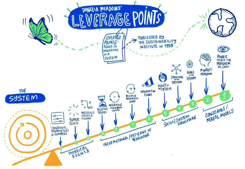
Leverage points by Donella Meadows is particularly interesting to me. I wish every design change or maturity effort started with this system mapping.
The idea is that to change the state of the system you need to impact one of those levers. Intervening at the bottom of the diagram (physical events) has little impact and can be potentially hard to do. Intervening at the top (mental models) has huge impact.
This particular diagram isn’t quite right for design contexts but it gives a good idea. We need to find leverage points worth investing in and stop spending time on things that don’t make impact. ROI comes to mind. It lives squarely in the “constants, parameters & numbers” bucket. I once spend a tremendous amount of effort trying to prove the ROI of research. It has an impact of sorts and I was successful. How much more impact would I have achieved had I invested time in changing mindsets and mental models though.
It’s an interesting area to explore. Design as a system. What are our leverage points? What are the actors within the organisational ecosystem we could influence? Where are the information flows and positive feedback loops?
Over Christmas I finally put words to it: I’m not frustrated with design as a craft, I’m frustrated with what our industry keeps rewarding. The incessant need to justify our existence. The chronic underfunding. The endless discourse about personas vs. archetypes. The constant stream of “UI best practice” posts on Medium, as if the world’s biggest problems are waiting for the right UI checklist.
I stopped going to UX conferences because too many talks orbit the same small set of deliverables. I stopped reading most “UX internet” content for the same reason: it’s either another method primer, another hot take about AI, or another thread of UI optimisation tips dressed up as insight.
I think we need to be honest with ourselves about what that looks like from outside. A profession asking to be taken seriously while arguing over its own tools.
This has to stop. As soon as UX entered the public realm “seamless” stopped being the harmless default.
Best practice became dogma
For the past two decades the governing paradigm for digital products has been “seamlessness.” Reduce friction, raise efficiency, get people to the thing they came for as fast as possible. We treat conflict as a “pain point” to be designed or engineered away.
This is great when you’re helping someone buy trainers or book a train.
However, as digital tools increasingly mediate democracy, public wellbeing, and economic participation, the limitations of “UX best practice” become glaringly obvious.
Infinite scrolling that gets people addicted, algorithmic information bubbles that amplify political polarisation, public services where decisions are made “behind the scenes” with no user involvement.
We’ve internalised that “good design is invisible.” We celebrate low cognitive load. We measure success with conversion, time-on-task, and completion rates. Eliminate friction at all costs, but friction is the not the enemy. Sometimes friction is the moment a person realises, “hang on, who decided this? On what basis? What are my options? What if this is wrong?”
The uncomfortable truth
The uncomfortable truth is that mainstream UX is optimised for profit. A large portion of what we call “UX maturity” is actually commercial maturity. Our best practices are standardised because they scale revenue. Our metrics are legitimised because they map cleanly to growth dashboards. Our case studies get celebrated because they show uplift. The kind of story that reliably gets you interviews: I built a thing and it resulted in £Xm in revenue uplift.
Now, there is nothing inherently wrong with designing for commerce. The problem is what happens when a discipline is optimised for selling is applied to policing, credit scoring, immigration, public health, and urban planning.
In these contexts, “seamlessness” can become a black box: a denied loan, a risk score, a decision about eligibility. A filtered view of reality—with no explanation, recourse, or accountability—presented as objective rather than design choices, politics, incentives, and biases.
When a system is seamless it often has no meaningful place to question it, no way to appeal or disagree. Seamless UI strips users of their agency.
Introducing agonistic design
Usually I just moan. This time I found a solution. I thrive in adversity, honestly, I kick myself for not coming across this sooner.
Agonistic design is an approach that makes room for friction, the struggle, fosters community and tries to make spaces for conversation between users and systems. It’s based on a book Adversarial Design (DiSalvo, 2015) and articulated further in a journal article The Right to Contestation (Collins et al., 2024). I’ll attempt to summarise.
Design should do the work of agonism—from the Greek word ‘agon’ or ‘struggle’, which is central to the political idea that all productive democracies are built on dissent and conflict—by creating spaces, artifacts, and interactions that allow for the expression of dissensus. It shifts the role of the designer from a “problem solver” who harmonises conflicting needs to a “provocateur” or “mediator” who reveals conflict and allows stakeholders to navigate it productively.
This means that in certain contexts (particularly those involving AI, public services, and high-stakes decision-making) our goal should not be to make the system easy to use but to make it “contestational.” We must design systems that allow users to question the system itself.
I love this idea.
Illustrative example
A few months ago I was arguing with my wife. The content is irrelevant and the reason is lost to time. I went to my favourite LLM and, since I wasn’t thinking all that rationally, asked it for advice on the situation. It completely validated my feelings. I went to another LLM. The output was the same.
The third one called me out. It pointed out what I was doing, named the problematic assumption in my framing, and forced a pause. That was a lightbulb moment. Systems that are optimised for agreement and “delight” can quietly train us away from self-critique. Sometimes what we need isn’t a smooth experience. Sometimes we need a moment of friction that creates space for accountability.
Agonism in public service
I highly recommend reading this paper in full. I’m probably going to do a terrible job summarising all of its intricacies and nuances.
In a two-year design ethnography with the City of Atlanta’s Mayor’s Office of Immigrant Affairs, researchers Corbett and Le Dantec (2021) developed the “Trust-as-Distance” framework. They were asked to design a system to help immigrants navigate housing code violations.
The “smart city” logic dictates that trust is built through efficiency. By making government services fast, digital, transparent, and by essentially removing distance. However, the researchers found that for vulnerable populations (undocumented immigrants) “distance” was actually safety. Digital records could create a trail that could lead to deportation.
Instead, trust was built by maintaining distance where it protected people, while creating closeness through human relationships. Through a combination of digital and non-digital components, like a Code Guide (a pamphlet used to explain rights and violations) and a Repair Request Webpage (no app or account needed).
By resisting the “Neoliberal Design Logic” of sticking everything into a seamless and efficient app and by using technology to mediate work rather than delegate it the researchers built trust, accountability, and equity into the service.
The paper closes on an idea that as HCI research (and User-Centred Design by proxy) moves deeper into the civic sphere, designers must recognise that trust is not a simple metric to be optimised but a complex political grant of power that carries the risk of legitimising injustice if misplaced. By adopting agonistic principles designers can move beyond transactional efficiency to focus on relationships.
How should designers understand (and when necessary) resist desires to make things “more efficient”? How should we view the role of design interventions: as mediators or delegators?
Closing thoughts
If UX feels stagnant it’s partly because we treat it as a set of deliverables and templates. Agonistic design isn’t the same as antagonism. It’s about designing legitimate ways to disagree with a system and be heard. It’s designing conditions for disagreement, explanation, and recourse; especially where these decisions affect people’s lives.
Here are a few ways to start, even inside a commercial design role:
Add a “contestation check” to decision points (eligibility, ranking, refusal, enforcement)
Design friction intentionally (confirmation pauses, “why am I seeing this?”)
Make reasons legible (inputs used, “would would change the outcome”)
Build recourse paths (appeal, correction, human review)
Broaden your reading diet (HCI, Design Research, STS)
So let’s stop arguing about the furniture arrangement of our methods and start building a mature design practice that can stand in the real world.
It’s by looking outside of UX that we get fresh ideas. It’s by having discussions about the nature of design that we grow as a field. It’s by educating new generations of UX designers on more than just “best practice” that we mature. It’s by creating spaces for discourse and dissent with the way things are right now that we build a better world.
We need dissent. We need discourse. We need agonistic design.
Disclaimer: Human-centred AI is a huge field that combines ethics, sutainable development, technology, some pretty advanced computer science, and more. We’ll be talking about the design side of things. AI was used to conduct research for this piece and find sources and facts. All words are my own.
I’ve seen some terrible implementations of AI in firms. I mean truly, truly awful. Imagine using a proprietary AI—a simple GPT wrapper with custom instructions—but for some reason the business decided to build its own front end for it. Now imagine that same firm blocking access to the usual AI tools like Gemini, OpenAI, Claude, Perplexity, and everything in between. Now you’re stuck with an inferior model (Gemini 2.5 Flash, for example) that lives in a terrible proprietary interface.
You can access the chat history but you can’t search it. There is a saved prompt library to save time but you can’t make your own to suit your needs. There is also something called “agents”, which are like Gemni Gems or OpenAI custom GPTs, but again you can’t make your own. The proprietary AI constantly cuts off long responses and you have to re-run the prompt by specifying “continue from bullet point #3,” which costs tokens and your own valuable time.
Frustrating, isn’t it? Shouldn’t happen in 2025, right? Well, you’d be surprised how often this happens.
We could dig into the phenomenon. Why do companies insist on building shitty AIs wrapped in shitty UI? Fears about security, reputational risks, business objectives, all that isn’t that important for this article. It just happens and it sucks. Let’s try and fix it.
I can’t believe I’m saying this in 2025 but the secret sauce is involving your users at every step. Welcome back to 1982. Blade Runner is in the cinemas, anthropomorphising the humanity’s fear of advanced AI. IBM, already a computing giant, is democratising technology by putting a computer on every desk. Michael Cooley writes a short book called “Architect or Bee? (The Human Technology Relationship)” in which he coins the term “Human-centred Design” for the first time.
The idea was simple: the technology should be designed to enhance human capabilities, creativity, and problem solving, rather than simply replacing human effort or reducing complex tasks to simple, repetitive actions. The idea endured for 43 years and is now central to the emerging field of Human-Centred AI.
Our personal boulder of Sisyphus
So why then do we keep banging our heads against constant lack of investment, lack of resources, lack of buy-in? I think of Design and I think back to the countless LinkedIn posts and Reddit threads bemoaning the challenges we face in getting buy-in. Design is routinely deprioritised, understaffed, underresourced, and underappreciated. Designers go about their lives championing, advocating, getting alignment, getting buy-in and getting shut out of big strategy meetings.
The reason is as cynical as it is simple. The lack of buy-in is due to the lack of tangible benefit. Human-Centred Design is still seen as a naive, idealistic philosophy, rather than valuable part of the process. McKinsey can write a thousand reports on the business value of design, no one will listen.
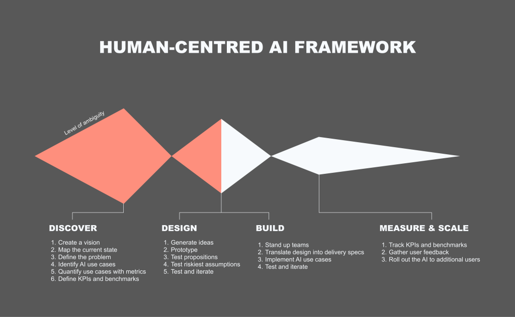
Framework for Human-Centred AI
I’m not re-inventing the wheel here. You might’ve seen variations of this framework everywhere. Double-diamond, tripple-diamond, Alpha-Beta-Live, Imagine-Deliver-Run… the list goes on. The point is that I’m proposing specific methods and activities within each “diamond” that are unique to designing AI products. Read on.
Discover
1. Solve an actual problem
Do. The. Research. Talk to your users. See what their problems actually are. Not doing so is akin to a general sending in his army without reconnaissance. Companies just slap AI on anything these days. That inevitably fails unless you solve an actual problem worth solving with AI.
2. Pick ambitious use cases
AI can do a lot of useful stuff. It can summarise, pull documents, generate content. From talking to your users you’ll have a good idea of what they need. Prioritise the use cases and pick an ambitious one. No point in solving small problems, right?
3. Define KPIs and benchmarks
I like a good old fashioned planning workshop. There is a lot of data out there. Just sit down and do it, however long it takes. A day, two days, a week. It doesn’t matter. If NASA engineers can meticulously plan out 10,000 single points of failure and plan contingencies for each one — so can you map out some KPIs and benchmarks. This is key. The more specific and granular, the better. For example, “we want to improve efficiency of annual reports” is terrible. “We want to reduce the time it takes to produce an annual report from 40 hours to 4 hours, 95% accurate pre- and post- human audit” is much better.
Design
1. Design with users and iterate often
This is also not new. Brainstorm, test, iterate. We’ve been doing this for 40+ years. I usually start with rough concepts, progress to low fidelity prototype (little more than interactive powerpoints), and only then—as the ambiguity reduces with each iteration—move on to fully clickable or functional prototypes.
2. Measure KPIs early
Measure whatever you can measure with prototypes. There are tools to tell you how successful a usability test was: System Usability Scale, my own AI Experience Score (AES), UX-Lite, and many more. The key message is to measure qualitatively to begin with. Forget automated AI benchmarks, we’re not building new models here.
Build
1. Start small
Build quick spikes, functional prototypes, show them to users, get feedback. Start small and scale up. 5 users, 10 users, 100, 1000… and so on. Here’s a cautionary tale I’ve seen across multiple large organisations: teams work in isolation on some proprietary AI tools, teams release their creation to the wider company, the AI tools performs poorly, consultants are brought in to figure out why and create an adoption strategy that’s already build on shaky foundations. This expensive mistake would’ve been avoided completely with a robust ‘test and iterate’ cycle or a closed Beta to gather feedback.
2. Continue to measure KPIs
Continue measuring. Perhaps now we can use AES quantitatively, include analytics. The more data you gather the better. To expand on the pattern I described above: an AI tool is released, adoption and engagement are poor, no one knows why. Consultants are brought in but no usage data or user feedback is available. Consultants are forced to run expensive research to understand why.
Scale
1. Bake in feedback mechanisms
Analytics feedback is great but it won’t tell you why people are doing what they are doing, or what exactly they are frustrated about. We had a discussion about this with a client just a few weeks ago. They saw high drop-off at a certain part of their journey. It was a form field on a certain page during onboarding. The drop-off spiked there and no one knew why. During interviews it turned out that that particular question had nothing to do with it. The culprit was the form field below, which was unusable and unaccessible. Analytics data will only tell you so much, user research is the thing that will help you pin-point the problem.
2. Measure ROI
This is where we get to the meat of the matter. Hopefully you’ve been collecting data and measuring progress this entire time. Now it’s time for that presentation back to the board. Let’s talk more about that in the next section.
Measuring ROI
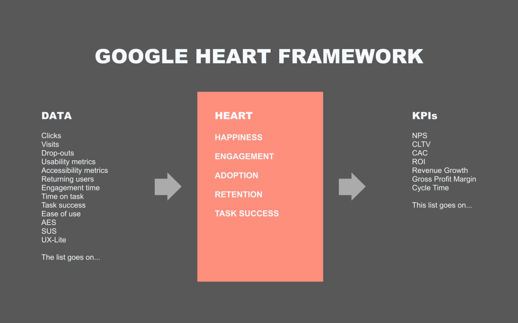
I love the Google HEART framework. It ties subjective terms like “happiness” with objective measures, like “satisfaction scores.” It also allows you to track the impact of design on the bottom line. You can read more about the Google HEART framework here.
I’ll give you an example. We were building a new product. I called in a workshop. In it we had representatives from design, product, technology, analytics, and data science. We went through the exercises and design ended up being responsible for “Happiness.” We measured it by taking our overall satisfaction score, which we measured with usability studies and contextual surveys on site. I aggregated a whole bunch of various usability metrics into an overall Happiness score, which was displayed on the Google Analytics dashboards for the whole business to see. The data science team then used this aggregated score to measure its impact on a) downstream KPIs (e.g., CLTV) and b) the gross revenue. For the first time we could improve something on the site and see that, for example, it resulted in a 2% uplift in revenue. This was huge. The principle is the same for AI. Plan the metrics in advance and find a way to tie them to the bottom line. Suddenly all ROI calculations become a lot easier.
Conclusion
If you want to succeed in this AI race we’re seeing, then a Human-Centred approach is what’s going to get you there. Start with a vision, speak to actual users, map out the whole process, test and iterate often, plan KPIs in advance and measure them relentlessly throughout. Let’s avoid a future where companies pour money into crappy AI that benefits no one.
Disclaimer: You know I’m a D&D nerd. This will be written with a D&D nerd’s perspective. This is done on purpose, because this is how I think about this. Also, this article was written by me and me alone. If anything sounds like AI, it’s by pure coincidence.
Anyway, let’s get on with it.
Last week Google dropped a bombshell. Out of nowhere we learn about the new open-source A2UI protocol that they developed. The premise is quite simple: the protocol allows AI agents to create UI on the fly from pre-made components. Kind of like making full Lego kits in real time from some pre-assembled bits. Here’s a wheel, here’s a frame, here’s a big bazooka. You can make a bicycle or a tank, depending on what you need right now.
This solves an inherent problem of text-only interaction—the clunky back and forth to get anywhere. I want to book a train ticket. Where are you going? London. Where are you right now? Manchester. What time are you going?.. and so on. Awkward, right?
Wouldn’t it be nicer if the agent just popped up a booking form right away?
Yes, this is still a good old booking interface, but it’s contextual and personal. The microcopy is written for you, it is surfaced when you need it—saving you the trouble of going to trainline and clicking through five million screens—and it’s isolated. By ‘isolated’ I mean you can then ask it to book a hotel in the same conversation, you don’t need to faff around with multiple websites. That’s the promise anyway.
Story time (skip if you’re not indo D&D)
As a DM preparing a game I often have a choice: use a pre-written published scenario or write one myself. A published scenario is a safe bet. It’s balanced, playtested, and has an interesting storyline (I wouldn’t choose a scenario without one). Writing one myself often results in an experience uniquely tailored to my players but requires more preparation. We have a player who really loves exploration, so I add a scene where they explore an ancient flooded temple; we have another player who loves combat and feeling powerful, so I give him a little power trip when they’re killing some exotic enemies.
But there is a third, chaotic and fun option that always results in maximum fun and shenanigans: delegate everything to your improvisational skills and go completely sandbox. This is usually extremely fun (and funny!) but it requires a very unique skillset of pulling out encounters, locations, storylines, characters, enemies, traps, puzzles, loot, villains, twists, story hooks—the list goes on—out of thin air. You also need to anticipate your player’s every move and be prepared to scrap your plans at a moment’s notice.
Here’s a fun example: I was running a city adventure. The players were in the sewers trying to locate a bandit’s hideout. I designed a trap room at the end of a long corridor. It was a diabolical trap with a puzzle element—I was very proud. Then, out of nowhere, one of my players, for some reason, decided to look for secret doors while they were carefully navigating the sewers. Here goes my carefully designed puzzle trap. Oh well…
I could either tell them there weren’t any or I could roll with it. So we rolled with it. Problem is, I was a few beers in after a long day at work, and my brain refused to come up with interesting things for my players to find behind that secret door and I didn’t want to spend an age brainstorming and coming up with something.
Introducing the excellent book of random tables!
I quickly pulled it up, found a section called ‘city encounters’ and with a few rolls of a die established that it was indeed a library and the plot hook is that a merchant’s cargo was stolen and he’s looking to get it back.
Then my brain finally got in gear and I thought that it would be cool if the cargo was important for the gang the players were hunting. Result? We went on a fun side-quest, the puzzle trap all forgotten.
Implications for design
This is exactly how I see the new A2UI protocol. It’s a book of random tables to help the DM (the agent) orchestrate the user’s experience… and it’s genuinely exciting (!) but scary too.
The terrifying open-ended reality changes the nature of a designer’s job. We are the people writing the random tables. To take my D&D metaphor further, we move up from writing scenarios (user wants to book train tickets) to writing The Sourcebook. We’re building the lore, the mechanics, and the random tables the DM needs to run their game.
Our focus must shift from visual composition and rigit user journeys to semantic definition of actions. In a sandbox the “monster” (or a UI component) needs clear stats and rules to function properly. The designer can’t just draw up a date picket box and hand it off. We need to write in-depth guidance on how the date picker works, and more crucially, when to use it. It’s all in the metadata. Is it suitable for X, Y, Z scenarios? Is it responsive? Does it require an API connection? If we don’t write the rules the Agent might spawn a complex desktop-only view for a user on a shaky 4G connection. The immersion breaks. No one is having fun.
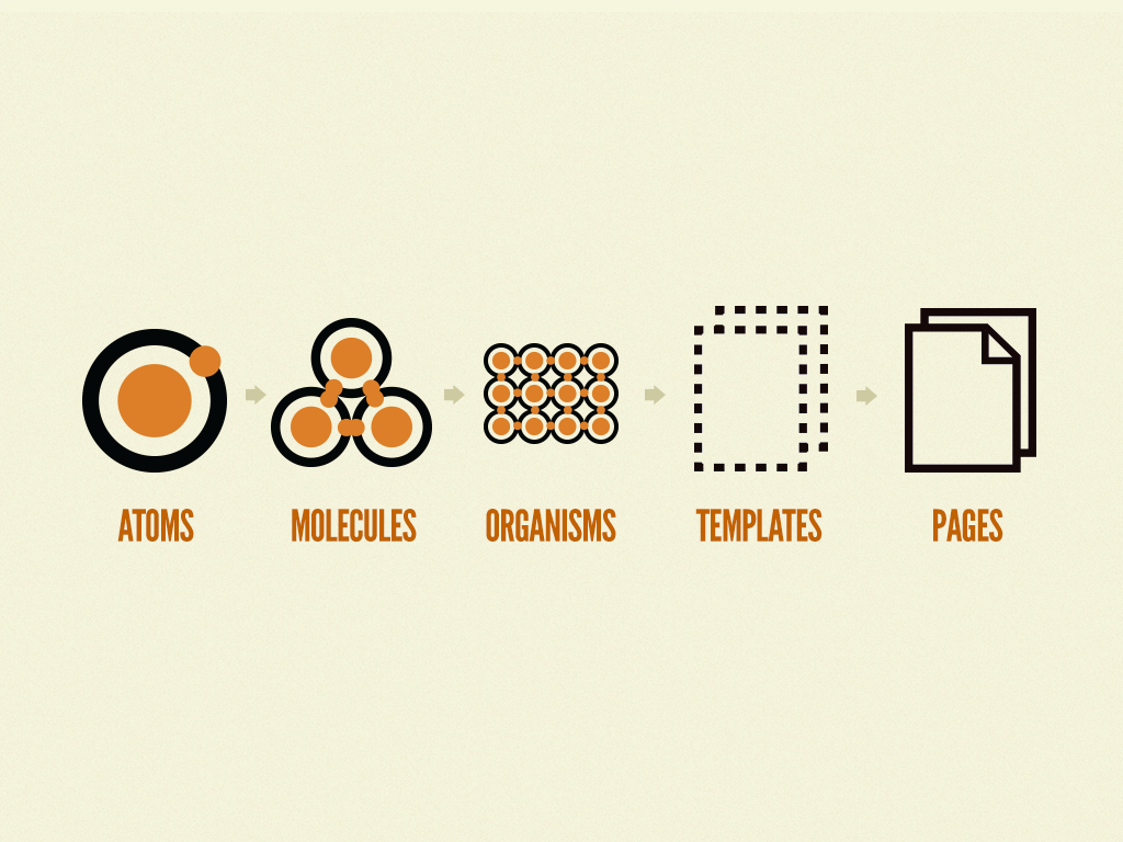
Yes, we are kind of moving into our long forgotten dream of Atomic design (remember that, back in 2016? And who says that history doesn’t repeat itself), but at the same time we’re also moving into the real of world building and experience orchestration. I like this new direction because in a non-deterministic web we can be the architects of experience, rather than executors.
Who remembers this from 10 years ago? A monumental book, it changed how we see design systems. It wasn’t perfect but it was a start and it influenced every design system out there right now. Wonder what Brad is up to these days…
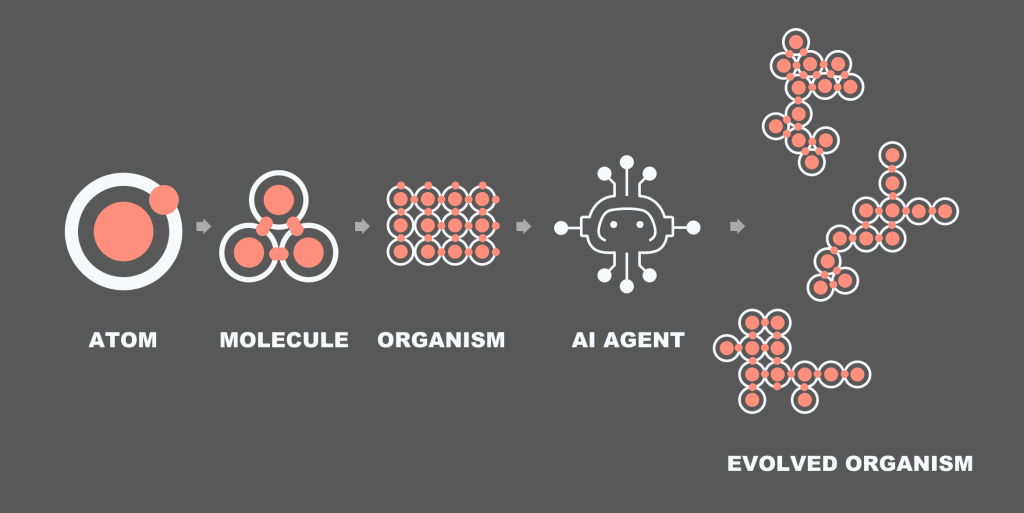
Anyway, here’s my updated version:
Source: Me
The idea is that we create the design system. But you know how templates and pages never made sense within the metaphor? Now they do. The AI can take a sample organism, read all the rules around it and assemble an organism of its own.
2. From flows to task models
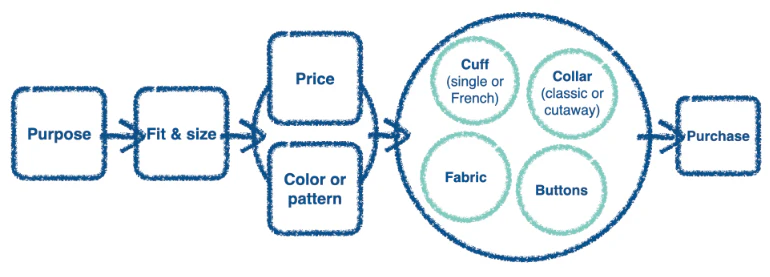
I always thought task models don’t get enough love in our industry. I read about them a while back and then absolutely no one ended up using them. It’s a shame because they illustrate how human minds work. Remember these? The objective of a task model is to illustrate the decision making flow. Don’t ask me where these originated, probably some Human-Computer Interaction journal or something. Here’s a super quick intro:
Source: Google
What we see above is a task model for someone purchasing a jacket. It’s built via user research. First you pick the purpose (wedding? night out?) then you try a few on. There is a strong connection between price and colour (not sure I agree with that, but oh well) and then you start looking at the small details that aren’t connected: buttons, fabric, etc. Finally you buy it.
The beauty of this diagram is that it allows you to map out messy decisions with multiple factors. Map out and prioritise them into a visual step by step illustration.
Now, with A2UI, instead of breaking up the above diagram into pages (browse jackets by size, click to view more details, checkout) we kinda just need to create a few little widgets that align with the steps:
The AI shows a selection of jackets based on user prompt (mini-product widget)
The AI reads out key features for the jacket someone likes the look/price of (no design needed, or maybe a lightweight product information screen)
Purchase (no need for a checkout widget)
From a multi-step user journey map to a couple of widgets built on the fly by the agent on the fly. The only thing we—designers—really need to think about are rules and molecules. The agent will do the rest.
Or so is the plan.
3. A world of metadata
This isn’t mentioned in the original Google article or anywhere in the documentation but this is what I anticipate. We’ll need to be extremely detailed and careful about what a molecule or an organism is and isn’t, can and cannot do. If you’re anything like me, you’re constantly frustrated with AI generated output in Figma Make. It’s always just a little bit too clunky and awkward, and is never 100% right.
Looking at the CopilotKit A2UI Widget Builder it’s obious that meta data is going to be king. At the moment the component page is a little… lacking. You have a preview, usage, props, and that’s it. Granted, I don’t actually know what’s going on under the hood and how their AI is making decisions, but keep an eye on this space. I bet some form of semantic metadata will be added soon to explain how each component should be used.
Maybe it’s a simple as dropping in a bunch of semantic tags. Maybe it’s as involved involved as attaching detailed written prompts about the intended usage of each widget or component. Time will tell.
Some closing words
This is an exciting development and I have a feeling that this is where web is going. I now do most of my Googling with Gemini, and most of my coding with Claude. I really don’t see us going back. See my previous blog about quiet AI revolution. There is a fun story there about my mum.
I won’t be surprised if in 10 years time we’d separate our web experience into functional (booking stuff, searching stuff) that will be done by AI and non-functional (reading blogs) which will be AI-facilitated.
If I want to book a train, I’ll use my AI agent to do that for me. If I want to read a fun blog on anthropology, I’ll probably use AI to find the blog and then click into the page and read it myself; or I might be lazy and ask it to summarise it. Our world of web is getting smaller, but I’m optimistic that it’s also getting a little bit more useful.
Note: I’m unable to share original designs for this project due to client confidentiality.
Situation
A national higher education admissions platform provider’s ambition is to leverage data and AI to help students decide on a course they will study. Legacy systems, a non-profit status, and complexity of the topic—courses, course derivatives, course features, the wide range of available institutions, and the need to remain in the role of a neutral advisor—prevented them from achieving this ambition.
Previous discovery identified Salesforce Personalisation and Marketing cloud as viable options but the level of ambiguity and complexity was still high. The team was brought on to prototype an illustrative solution showcasing the art of the possible. Past efforts missed the mark, either focusing too heavily on technology, or not providing the necessary clarity for the client to move forward.
Task
Our task was two-fold:
to create a non-functional prototype for a single use case where a student might know the broad topic they’re interested in but is not familiar with the intricacies of the subject; and
to create user journey map that takes the student from initial registration to the final application.
Action
Conducted desk research to examine existing user research data and Salesforce data architecture discovery.
Co-facilitated an in-person design thinking workshop. The workshop was split evenly between visioning and ideation to help reach alignment and reduce ambiguity.
Designed a clickable prototype in Figma leveraging Salesforce features, previous data architecture discovery, and existing qualitative user research to identify user needs and behaviours.
Leveraged generative AI throughout as a thought partner and to produce fast Figma Make mocks that helped reach alignment quickly.
Introduced innovative interaction models to explore courses, subjects, and providers to 16-17 years olds and aim them in exploring and discovering new fields of study.
HECoS codes were used in conjunction with Generative AI to make connections between courses and help students navigate ~40,000 courses from 200+ providers.
Gamification principles were used to create an engaging onboarding flow for students.
Salesforce Personalisation engine was leveraged to passively build affinity and certainty scores and to surface content based on them.
Tag clouds and node diagrams were used to help students navigate subjects and discover associated areas of study (e.g., Biology -> Microbiology or Biology -> Immunology)
Result
The prototype, designed collaboratively with the client, will be evaluated with real students by the client’s user research team early in 2026.
tl;dr: Human centred AI (or HCAI) is a paradigm, similar to human centred design, that contains methods, tools, and principles to ensure AI is designed with humans at its heart, that it’s usable, accessible, safe, and trustworthy. It’s aimed to give designers, researchers, technologists, developers, entrepreneurs a framework to achieve these goals.
Note: This article is about design and written by a designer. I don’t pretend to know anything about actually developing AI models or even AI products. I do know how to make great products though.
Why is Human Centred AI important?
Let’s start with a short story. Your company decides to build a proprietary GPT wrapper that’s secure and trained on your company data. They go ahead and build it and for some unexplained reason no one is using it. It’s down on all metrics and people still insist on using OpenAI or Google variants on their phones rather than engage with the tool your company spent millions developing from scratch.
What’s going on?
Eventually someone somewhere decided to do some user engagement and find out. Turns out that people hate it. You can’t edit your prompt, you can’t stop the system from generating its answer mid-flight, and the output it does produce is riddled with errors and is probably a bit racist. Most infuriatingly, it doesn’t even solve the user need for fast, reliable answers about your company policy.
Oh no! Should we have engaged with users from the start?
Let’s look at another side of the spectrum. Human-centred designers and researchers come on scene early. They run workshops with stakeholders and users to reach consensus on what the system should do, find all the current frustrations people are experiencing, and actually it turns out that no one has any issues with getting accurate answers quickly. The real problem is in the minutiae high-effort tasks, like doing desk research or consolidating multiple reports into one summary.
The scope is tweaked, some money is saved, and the team proceeds to build a focused, single purpose chatbot that does desk research and writes research summaries.
The team puts in clear measures that show the product is moderately successful and saves people a bit of time every day. Everyone is happy.
What the research is saying
In our previous research we spoke to several individuals around Manchester area to understand their usage of generative AI at home. The main theme was that people use it for small and low-risk tasks. Finding recipes, writing short, fun poems in another language, writing a complaint email, that kind of stuff.
In other, “real” academic research HCAI is all about developing models that don’t kill us all or turn the world into a dystopian Matrix-esque nightmare. There are things there we can adapt for our purposes.
There is a lot of academic writing on the topic out there. I checked. Most of it deals with the development of AI, but some of it is useful in the design context.
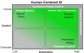
Ben Shneiderman wrote Human Centred AI in 2020 and an updated edition in 2022. It described the need for involving humans in the AI development process. However, it also showed several frameworks for AI-Human interaction. Like this one:
It shows the level of automation and control over various objects. When designing products, it’s worth keeping in mind features that go into the “Excessive” buckets. That GPT wrapper I described earlier and that you couldn’t stop? Excessive automation.
In another paper, Xu Wei proposes a methodological framework that’s rather complicated and geared towards developers, but it proposes several principles, that I adapted in our work at Deloitte.
Human centred AI principles
Principle 1: Usable
The AI must be usable. Duh. You ever used an AI tool that was a pain to use? I had this experience with many an “internal proprietary AI tool” across industries and clients. You want to upload a document? Click on this button. Then that button. Then wait. Then click to “Add file to chat”. Disgusting.
Methods to consider
Usability testing
Accessibility testing
Co-design sessions
Principle 2: Useful
You ever used an AI tool and thought, “why is this here?” Remember the failed WhatsApp chatbot? I asked it, “why are you here?” and it told me it’s there to answer questions and be a buddy. How is it different to clicking on an app in your phone then? No different. What’s the USP? It’s in your WhatsApp. We are obliged to design tools that actually answer a need. A product without a need is just an expensive failure.
Methods to consider
Visioning workshop
Process mapping
Service blueprinting
User journey mapping
Prioritisation frameworks (ICE, MoSCoW)
Decision trees
Principle 3: Trustworthy
How do you know you can trust the chat’s output? We know generative AI can be biased and error prone. There are ways we can increase this trust. There is a neat list of AI patterns out there on the Shape of AI website. Here are some of my favourite that I’ve used in the past.
Patterns to consider
Caveat (AI responses can be inaccurate)
Consent (Do you consent us using this data for training?)
Watermarks (AI generated)
Showing your work (not on Shape of AI but Perplexity and GPT5 are doing this now)
Principle 4: Scalable
Scalable can relate both to the techy under-the-hood but also to the product itself. A product that requires constant monitoring and is prone to errors is not scalable. A product that fits seamlessly into users everyday workflows is. A workflow is predictable, debuggable, and scalable. A loose cannon agent that makes decision on its own is none of these things.
Patterns to consider
Workflow mapping
Business process mapping
Service blueprinting
User journey mapping
Principle 5: Responsible
Oh ethics, my favourite topic. How do we make sure the AI isn’t bad? How do you make it ethically sound but also use it in a safe and ethical way? There are lots of issues there. The black box problem, the biases, the errors, the AI psychosis, people using AI in unethical ways to fudge experiments with synthetic data… the list goes on and on.
Mitigation strategies to consider
Human review of training data
Publish guidelines and policies for safe AI use
Human review of outputs
Principle 6: Empowering
Closely related to it being useful, this goes one step beyond. What’s the point in creating an expensive tool that doesn’t only help people but also empowers them to be better? It’s a debate between augmentation and automation. Automation makes a task easy, augmentation allows people to do things they never thought possible. To do this you really need to understand human needs and find ways to create a symbiotic relationship.
Methods to consider
In depth interviews
Co-creation workshops
Service blueprinting
Principle 7: Controllable
My pet hate. Just add that “Stop” button in! It goes beyond that of course. How do we create an AI that keeps the user in the driving seat? That doesn’t do anything unexpected but also has enough automation to be useful? It’s a fine balance and goes back to Ben Schneidermann’s automation vs. control diagram above. There is a beautiful blog that goes into a lot of detail on this topic here.
Various toggles to control variables in an output (e.g., MidJourney has a detail toggle)
Stop button (obv!)
Conclusion
Human centred AI is the next evolution of human centred design. It’s not a paradigm shift, per se, but more of an update for the age of AI. The tools are generally similar: talk to users. If you’d like to dive into the topic further here’s a list of reading materials that are worth your consideration:
I’ve been working on something fun that I want to share with the design community. A ‘quick and dirty’ usability score for AI I’m calling the AI Experience Score (AES)—not to be confused with the Advanced Encryption Standard, the name is still WIP—inspired by System Usability Scale and all the evaluative scores that came since.
Back in March 2024 I did a some desk research to see how people build amazing AI products. I looked at HCI papers around the topic of AI, agentic design, and developing human-machine interactions. What I found was a distinct lack of specific guidance or methods. How do we run usability testing with AI interfaces? How do we measure how well we did? No one had the answer. So I set out to find a way to objectively measure how well an AI solution is performing.
Eventually I came across the original System Usability Scale paper and thought, “hey, I can follow the same process and make something useful!”.
With the help of many colleagues, I put together a basic questionnaire based on the SUS and UX-Lite—yes, Jeff Sauro is a bit of a hero of mine—and tested it across two rounds of user testing. I tweaked the wording of the questions in between to align with the 5 key principles of Human-Centred AI:
Usefulness
Ease of Use
Trustworthiness
Controllability
Empowerment
Xu also mentions Scalability and Sustainability, but I deemed these things to be decided at model level rather than a specific AI interface.
How to use
The questions are (5-point Likert; Strongly Disagree – Strongly Agree):
The agent’s capabilities match my needs
It was easy to achieve what I wanted using the agent
I trust the agent’s responses
Using the agent enhances my own capabilities
I can consistently get the answers I want to my questions
This formula gives a final score out of 100:
(((∑Q1–5)-5)*(100/25))+10
(Sum the scores, subtract 5, multiply by 4 and add 10 to the result)
Administer this summative questionnaire after several scenarios at the end of a usability testing session or add this to a contextual survey on your website to get a longitudinal view of the score.
Validating the score
Tested and iterated across 2 rounds of testing the final scaled score was reliable (Cormbach’s alpha = .88) and correlated with NPS (r=.80, p=<.001, n=36) and CSAT (r=.92, p=<.001, n=18).
Though the results are encouraging there are obvious limitations. I would really love for the UX community to test the score on a real product with larger samples and tell me how it went. I’m also keen to hear ideas and feedback on how to improve it.
About 10 years ago I went on IDEO’s human-centred design course. It was free, it was easy to grasp, and it gave us the tools we needed to design great products. It’s still around, you can check it out here.
At the start of the course we learned about the design process: inspiration, ideation, implementation. We learned that first you speak to people. The methods included interviews, surveys, observation, and more. Then you brainstorm some ideas, test them and iterate until you got to a great solution. Finally you implement it, while continuously gathering feedback and tweaking the final solution until it’s “perfect”.
“Okay,” I thought, “maybe it’s pretty similar to the process I learned about in uni: Discover, Design, Test, Manufacture. Or maybe it’s similar to the process I learned in university: Research, Build, Iterate Aaaaand! It’s pretty similar to our beloved Double Diamond from the Design Council.
What’s going on?! It’s almost as if design process is universal whether you’re designing a video game character, a magazine cover, a chair, a toothbrush, or a website or service. The point I’m trying to make is that design is design.
Why then, is the industry so hell bent on dividing researchers from designers?
Look at any user researcher job on LinkedIn. Here’s one:
Bachelor’s degree in a relevant field (e.g., Human-Computer Interaction, Psychology, Data Science, Public Health). Advanced degrees are a strong plus.
And here’s a requirement for a designer:
Bachelor’s degree in Design, Human-Computer Interaction, Psychology, or a related field; Master’s degree preferred.
Does that mean that I designer won’t be picked for a research role? And vise versa? That’s just stupid.
Let me tell you a story. I went to a conference once and met some junior designers from a FAANG that I won’t name. User journey map? Haven’t heard of one. Do you run user interviews? No. What do you do then? We design the screens.
I could only chuckle nervously and excuse myself.
Here’s the problem with researchers who don’t design and designers who don’t research. Let’s say you’re a researcher who found some insights. You present them to the design team and they go away to do some designs but they don’t have the full context. It’s like having two halves of the brain that don’t speak to each other. I mean, we try, we communicate, but things ultimately fall through. We have these insight trackers and knowledge repositories, which are undoubtedly useful but don’t solve the core problem: having the full context.
My best time as a researcher was when I worked with a designer who used to run research sessions himself. He grasped exactly what was needed to be done, helped with the admin, and took some ace notes. Then, I took on some screens to design and helped him in return. We worked as one unit. It was great.
So the case I’m trying to make here is that designers should be researchers. You don’t need a PhD in Psychology to speak to some people and learn about their problems. Similarly, if you’re a researcher, I highly suggest you pick up some design skills. Ultimately, if you’re a hiring manager and you see a designer apply for a research position, think twice before rejecting them, and vice versa for researchers applying for design positions.
We did some research recently. We asked participants to recount a particularly frustrating experience with customer service. Almost every single one said, “I felt like they didn’t listen.” and something in the vein of, “I need to know that they got my back, that they understand.” Isn’t it quite profound? Don’t you just want to call customer service and have someone tell you that everything is going to be okay?
Empathy is a very human concept. It’s important for us to know that the other person understands what we’re going through. “Hey, I’m sorry, that sounds frustrating!” and suddenly everything is just this little bit better. So why don’t we have this in customer service? A business function that’s designed to make customers’ lives better?
Imagine my surprise then when most participants then proceeded to say that they don’t actually don’t care much that they don’t speak to someone as long as the thing they came here to do is done. I understand the sentiment. Sometimes you just want to get a thing done.
There is nuance of course. Some things you just need to speak to a person about. Especially when it’s something complex or sensitive.
So the point is this:
Speaking to a human is important, but not as important as getting shit done.
Great, Arty, thanks for this pearl of wisdom. So what?
The so what is that I see a lot of companies make it impossible for customers to get shit done. They add pages and pages of searchable help articles that are as ignorable as they are useless. They add inefficient systems that take customer information only for the customers to have to say it all again when they get to an agent. They make agents life hell with 17 (yes, we heard this in our research too) tools to search for information.
The so what is that businesses need to prioritise getting shit done over anything else. Name change, renewal questions, basic stuff, it can all be automated. You don’t need an offshore contact centre. You don’t need to spend millions on training. You just need to make it easy for people to achieve their goals, and if that goal is to speak to an agent, then so be it.
How do we make it easy for people to achieve their goals? That’s the million pound question. Every business is different. Perhaps a talented (hint hint) designer can help you here. You could introduce Agentic AI, you could add a self service flow to make easy changes to the account, you could make your human agents’ lives simpler by automating parts of their workload. The solutions are many, the question is how do we find those solutions.