Featured image source: Shawn Kassian, Tomb Crypt, Artstation.
Disclaimer: You know I’m a D&D nerd. This will be written with a D&D nerd’s perspective. This is done on purpose, because this is how I think about this. Also, this article was written by me and me alone. If anything sounds like AI, it’s by pure coincidence.
Anyway, let’s get on with it.
Last week Google dropped a bombshell. Out of nowhere we learn about the new open-source A2UI protocol that they developed. The premise is quite simple: the protocol allows AI agents to create UI on the fly from pre-made components. Kind of like making full Lego kits in real time from some pre-assembled bits. Here’s a wheel, here’s a frame, here’s a big bazooka. You can make a bicycle or a tank, depending on what you need right now.
This solves an inherent problem of text-only interaction—the clunky back and forth to get anywhere. I want to book a train ticket. Where are you going? London. Where are you right now? Manchester. What time are you going?.. and so on. Awkward, right?
Wouldn’t it be nicer if the agent just popped up a booking form right away?
Yes, this is still a good old booking interface, but it’s contextual and personal. The microcopy is written for you, it is surfaced when you need it—saving you the trouble of going to trainline and clicking through five million screens—and it’s isolated. By ‘isolated’ I mean you can then ask it to book a hotel in the same conversation, you don’t need to faff around with multiple websites. That’s the promise anyway.
Story time (skip if you’re not indo D&D)
As a DM preparing a game I often have a choice: use a pre-written published scenario or write one myself. A published scenario is a safe bet. It’s balanced, playtested, and has an interesting storyline (I wouldn’t choose a scenario without one). Writing one myself often results in an experience uniquely tailored to my players but requires more preparation. We have a player who really loves exploration, so I add a scene where they explore an ancient flooded temple; we have another player who loves combat and feeling powerful, so I give him a little power trip when they’re killing some exotic enemies.
But there is a third, chaotic and fun option that always results in maximum fun and shenanigans: delegate everything to your improvisational skills and go completely sandbox. This is usually extremely fun (and funny!) but it requires a very unique skillset of pulling out encounters, locations, storylines, characters, enemies, traps, puzzles, loot, villains, twists, story hooks—the list goes on—out of thin air. You also need to anticipate your player’s every move and be prepared to scrap your plans at a moment’s notice.
Here’s a fun example: I was running a city adventure. The players were in the sewers trying to locate a bandit’s hideout. I designed a trap room at the end of a long corridor. It was a diabolical trap with a puzzle element—I was very proud. Then, out of nowhere, one of my players, for some reason, decided to look for secret doors while they were carefully navigating the sewers. Here goes my carefully designed puzzle trap. Oh well…
I could either tell them there weren’t any or I could roll with it. So we rolled with it. Problem is, I was a few beers in after a long day at work, and my brain refused to come up with interesting things for my players to find behind that secret door and I didn’t want to spend an age brainstorming and coming up with something.
Introducing the excellent book of random tables!
I quickly pulled it up, found a section called ‘city encounters’ and with a few rolls of a die established that it was indeed a library and the plot hook is that a merchant’s cargo was stolen and he’s looking to get it back.
Then my brain finally got in gear and I thought that it would be cool if the cargo was important for the gang the players were hunting. Result? We went on a fun side-quest, the puzzle trap all forgotten.
Implications for design
This is exactly how I see the new A2UI protocol. It’s a book of random tables to help the DM (the agent) orchestrate the user’s experience… and it’s genuinely exciting (!) but scary too.
The terrifying open-ended reality changes the nature of a designer’s job. We are the people writing the random tables. To take my D&D metaphor further, we move up from writing scenarios (user wants to book train tickets) to writing The Sourcebook. We’re building the lore, the mechanics, and the random tables the DM needs to run their game.
Our focus must shift from visual composition and rigit user journeys to semantic definition of actions. In a sandbox the “monster” (or a UI component) needs clear stats and rules to function properly. The designer can’t just draw up a date picket box and hand it off. We need to write in-depth guidance on how the date picker works, and more crucially, when to use it. It’s all in the metadata. Is it suitable for X, Y, Z scenarios? Is it responsive? Does it require an API connection? If we don’t write the rules the Agent might spawn a complex desktop-only view for a user on a shaky 4G connection. The immersion breaks. No one is having fun.
Yes, we are kind of moving into our long forgotten dream of Atomic design (remember that, back in 2016? And who says that history doesn’t repeat itself), but at the same time we’re also moving into the real of world building and experience orchestration. I like this new direction because in a non-deterministic web we can be the architects of experience, rather than executors.
But how?
1. Atomic design (but evolved)
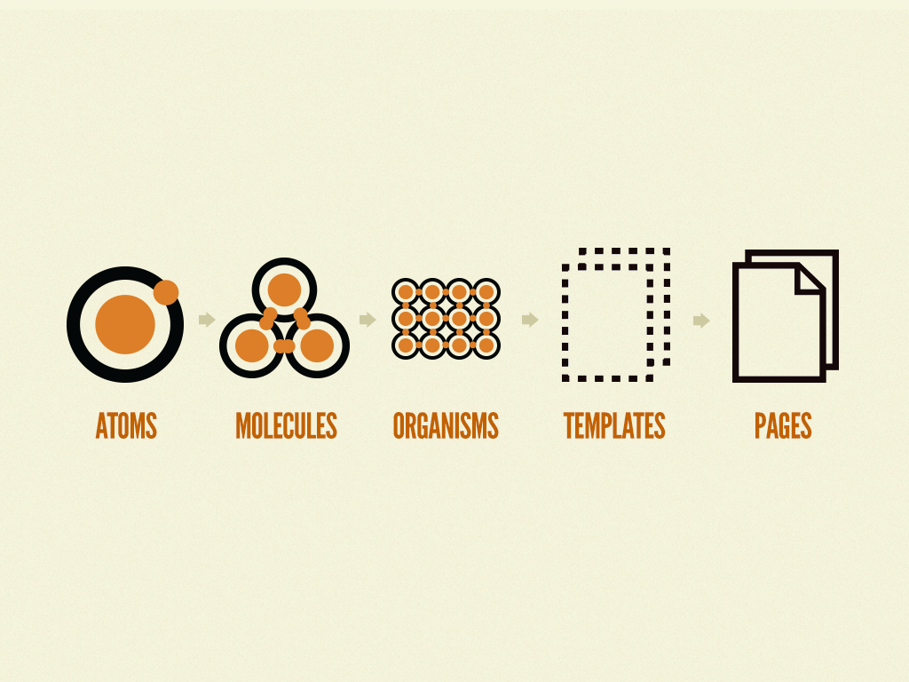
Who remembers this from 10 years ago? A monumental book, it changed how we see design systems. It wasn’t perfect but it was a start and it influenced every design system out there right now. Wonder what Brad is up to these days…
Anyway, here’s my updated version:
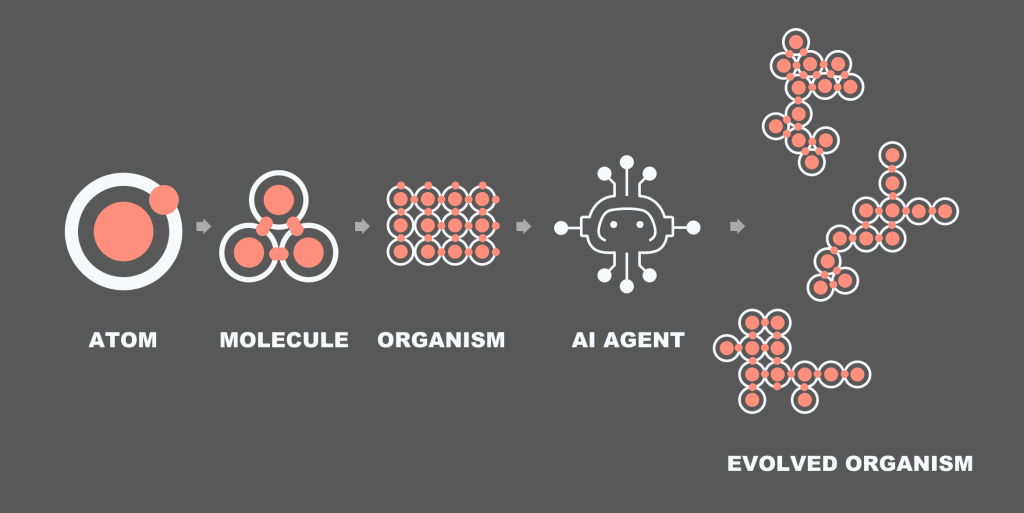
The idea is that we create the design system. But you know how templates and pages never made sense within the metaphor? Now they do. The AI can take a sample organism, read all the rules around it and assemble an organism of its own.
2. From flows to task models
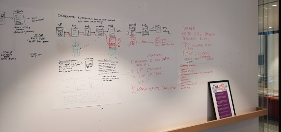
I always thought task models don’t get enough love in our industry. I read about them a while back and then absolutely no one ended up using them. It’s a shame because they illustrate how human minds work. Remember these? The objective of a task model is to illustrate the decision making flow. Don’t ask me where these originated, probably some Human-Computer Interaction journal or something. Here’s a super quick intro:
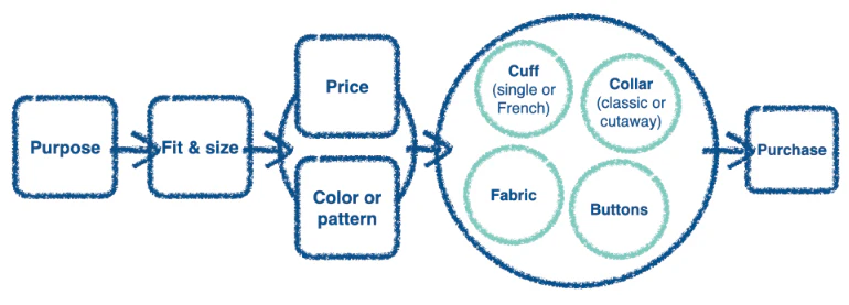
What we see above is a task model for someone purchasing a jacket. It’s built via user research. First you pick the purpose (wedding? night out?) then you try a few on. There is a strong connection between price and colour (not sure I agree with that, but oh well) and then you start looking at the small details that aren’t connected: buttons, fabric, etc. Finally you buy it.
The beauty of this diagram is that it allows you to map out messy decisions with multiple factors. Map out and prioritise them into a visual step by step illustration.
Now, with A2UI, instead of breaking up the above diagram into pages (browse jackets by size, click to view more details, checkout) we kinda just need to create a few little widgets that align with the steps:
- The AI shows a selection of jackets based on user prompt (mini-product widget)
- The AI reads out key features for the jacket someone likes the look/price of (no design needed, or maybe a lightweight product information screen)
- Purchase (no need for a checkout widget)
From a multi-step user journey map to a couple of widgets built on the fly by the agent on the fly. The only thing we—designers—really need to think about are rules and molecules. The agent will do the rest.
Or so is the plan.
3. A world of metadata
This isn’t mentioned in the original Google article or anywhere in the documentation but this is what I anticipate. We’ll need to be extremely detailed and careful about what a molecule or an organism is and isn’t, can and cannot do. If you’re anything like me, you’re constantly frustrated with AI generated output in Figma Make. It’s always just a little bit too clunky and awkward, and is never 100% right.
Looking at the CopilotKit A2UI Widget Builder it’s obious that meta data is going to be king. At the moment the component page is a little… lacking. You have a preview, usage, props, and that’s it. Granted, I don’t actually know what’s going on under the hood and how their AI is making decisions, but keep an eye on this space. I bet some form of semantic metadata will be added soon to explain how each component should be used.
Maybe it’s a simple as dropping in a bunch of semantic tags. Maybe it’s as involved involved as attaching detailed written prompts about the intended usage of each widget or component. Time will tell.
Some closing words
This is an exciting development and I have a feeling that this is where web is going. I now do most of my Googling with Gemini, and most of my coding with Claude. I really don’t see us going back. See my previous blog about quiet AI revolution. There is a fun story there about my mum.
I won’t be surprised if in 10 years time we’d separate our web experience into functional (booking stuff, searching stuff) that will be done by AI and non-functional (reading blogs) which will be AI-facilitated.
If I want to book a train, I’ll use my AI agent to do that for me. If I want to read a fun blog on anthropology, I’ll probably use AI to find the blog and then click into the page and read it myself; or I might be lazy and ask it to summarise it. Our world of web is getting smaller, but I’m optimistic that it’s also getting a little bit more useful.