Tag: Usability

  • Education personalisation

    Education personalisation

    Note: I’m unable to share original designs for this project due to client confidentiality.

    Situation

    A national higher education admissions platform provider’s ambition is to leverage data and AI to help students decide on a course they will study. Legacy systems, a non-profit status, and complexity of the topic—courses, course derivatives, course features, the wide range of available institutions, and the need to remain in the role of a neutral advisor—prevented them from achieving this ambition.

    Previous discovery identified Salesforce Personalisation and Marketing cloud as viable options but the level of ambiguity and complexity was still high. The team was brought on to prototype an illustrative solution showcasing the art of the possible. Past efforts missed the mark, either focusing too heavily on technology, or not providing the necessary clarity for the client to move forward.

    Task

    Our task was two-fold:

    • to create a non-functional prototype for a single use case where a student might know the broad topic they’re interested in but is not familiar with the intricacies of the subject; and
    • to create user journey map that takes the student from initial registration to the final application.

    Action

    • Conducted desk research to examine existing user research data and Salesforce data architecture discovery.
    • Co-facilitated an in-person design thinking workshop. The workshop was split evenly between visioning and ideation to help reach alignment and reduce ambiguity.
    • Designed a clickable prototype in Figma leveraging Salesforce features, previous data architecture discovery, and existing qualitative user research to identify user needs and behaviours.
    • Leveraged generative AI throughout as a thought partner and to produce fast Figma Make mocks that helped reach alignment quickly.
    • Introduced innovative interaction models to explore courses, subjects, and providers to 16-17 years olds and aim them in exploring and discovering new fields of study.
    • HECoS codes were used in conjunction with Generative AI to make connections between courses and help students navigate ~40,000 courses from 200+ providers.
    • Gamification principles were used to create an engaging onboarding flow for students.
    • Salesforce Personalisation engine was leveraged to passively build affinity and certainty scores and to surface content based on them.
    • Tag clouds and node diagrams were used to help students navigate subjects and discover associated areas of study (e.g., Biology -> Microbiology or Biology -> Immunology)

    Result

    The prototype, designed collaboratively with the client, will be evaluated with real students by the client’s user research team early in 2026.

  • Benchmarking AI usability

    Benchmarking AI usability

    I’ve been working on something fun that I want to share with the design community. A ‘quick and dirty’ usability score for AI I’m calling the AI Experience Score (AES)—not to be confused with the Advanced Encryption Standard, the name is still WIP—inspired by System Usability Scale and all the evaluative scores that came since.

    Back in March 2024 I did a some desk research to see how people build amazing AI products. I looked at HCI papers around the topic of AI, agentic design, and developing human-machine interactions. What I found was a distinct lack of specific guidance or methods. How do we run usability testing with AI interfaces? How do we measure how well we did? No one had the answer. So I set out to find a way to objectively measure how well an AI solution is performing.

    Eventually I came across the original System Usability Scale paper and thought, “hey, I can follow the same process and make something useful!”.

    With the help of many colleagues, I put together a basic questionnaire based on the SUS and UX-Lite—yes, Jeff Sauro is a bit of a hero of mine—and tested it across two rounds of user testing. I tweaked the wording of the questions in between to align with the 5 key principles of Human-Centred AI:

    •     Usefulness
    •     Ease of Use
    •     Trustworthiness
    •     Controllability
    •     Empowerment

    Xu also mentions Scalability and Sustainability, but I deemed these things to be decided at model level rather than a specific AI interface.

    How to use

    The questions are (5-point Likert; Strongly Disagree – Strongly Agree):

    •     The agent’s capabilities match my needs
    •     It was easy to achieve what I wanted using the agent
    •     I trust the agent’s responses
    •     Using the agent enhances my own capabilities
    •     I can consistently get the answers I want to my questions

    This formula gives a final score out of 100:

    (((∑Q1–5)-5)*(100/25))+10

    (Sum the scores, subtract 5, multiply by 4 and add 10 to the result)

    Administer this summative questionnaire after several scenarios at the end of a usability testing session or add this to a contextual survey on your website to get a longitudinal view of the score.

    Validating the score

    Tested and iterated across 2 rounds of testing the final scaled score was reliable (Cormbach’s alpha = .88) and correlated with NPS (r=.80, p=<.001, n=36) and CSAT (r=.92, p=<.001, n=18).

    Though the results are encouraging there are obvious limitations. I would really love for the UX community to test the score on a real product with larger samples and tell me how it went. I’m also keen to hear ideas and feedback on how to improve it.

  • Cheap energy club

    Cheap energy club

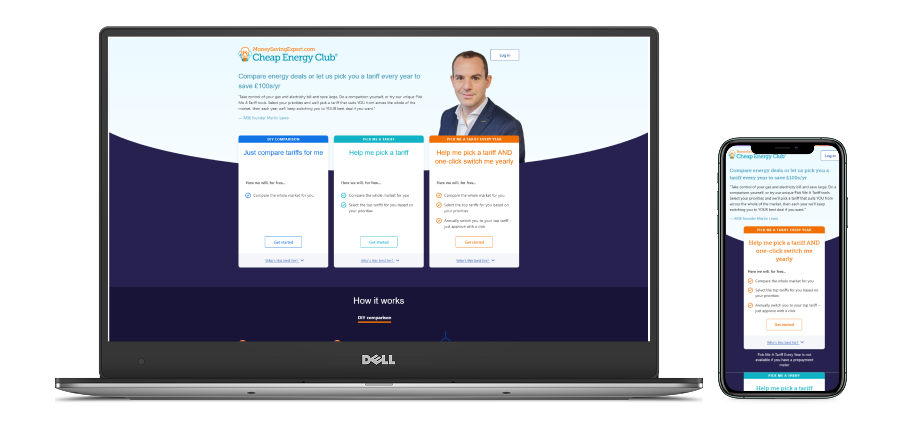
    I led design of an energy switching product. We conducted a comprehensive discovery to understand user needs, facilitated brainstorming workshop, designed the interface, and supervised build. The resulting product had an average SUS of 83 and accommodated 200 switches per month, with 600k active users.

    Discover

    We started with examining existing data from MoneySuperMarket’s energy switching product and conducted extensive desk research to understand what challenges users experience when switching energy. We also collaborated with marketing and data teams to understand wider market forces at play and understand the viability, feasibility, and desirability of the opportunity.

    We supplemented the desk research with a series of in-depth interviews to understand granular user needs and pain points around energy switching. We found that:

    • automated switching services do not take into account preferences beyond “Price” meaning that users feel not in control,
    • automatic switches based on price only sometimes result in poor customer experiences as energy companies chasing low price cannot compete with more sustainable competitors,
    • several participants reported being switched multiple times per year, resulting in frustration and unnecessary stress

    Based on this insight and behavioural characteristics of our sample we created several user archetypes, a log of user needs, and an “as-is” user journey map.

    Relevant skills: Discovery research, user needs, user journey mapping, user archetypes, qualitative analysis, workshop facilitation, quantitative market analysis, innovation management.

    Design

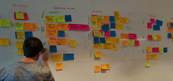
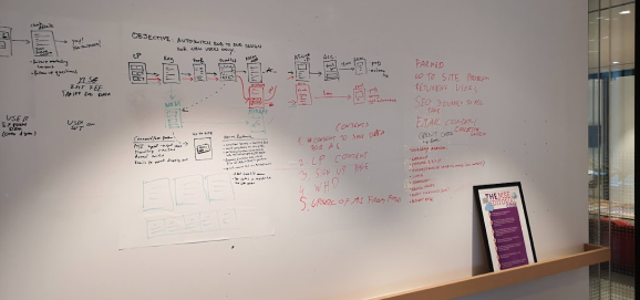
    We ran several workshops to co-design the new user journey. We used a range of methods. For example, in one instance we ran a mini-“design sprint”, which was a 4 hour workshop where we examined research findings, created ‘How Might We’ questions and sketched ideas with Crazy 8s.

    We relentlessly tested user preferences with remote unmoderated card sorting. We learned that control is a strong motivator. People feel in control when they get a say when to switch, they feel reassured when they are switched to a reputable brand, and they feel like winners when they switch to a cheaper deal.

    Relevant skills: Card sorting, HMW questions, Crazy 8s, workshop facilitation, stakeholder management, visioning, design sprint.

    Prototype

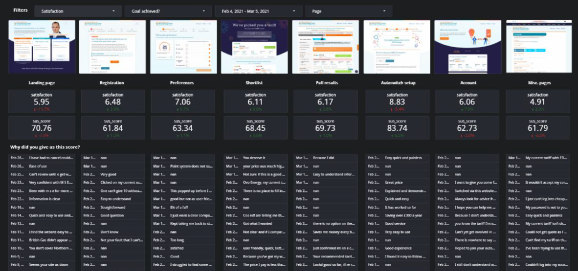
    We continued testing and iterating our prototypes. We started with simple paper prototypes (on paper) and moved through the levels of fidelity (Sketch, Axure, then Vue.js) as our understanding of the final solution developed. Most of the testing was unmoderated in UserZoom but we ran quarterly usability benchmarking sessions in person where we tracked usability metrics like time on task and our usability benchmark (System Usability Scale) to provide objective measure of design changes.

    As the cycles of testing and iterating progressed I worked closely with the Performance Analytics team to develop a measurement framework. My passion for usability helped me introduce and integrate the Google HEART framework to correctly attribute UX changes to revenue. The resulting dashboard, which I developed leveraging my skills in Python and understanding of Google Analytics, is still used to this day.

    Relevant skills: Prototyping (Azure, Sketch, HTML/CSS), usability testing, KPI creation, measurement frameworks, Google HEART, Python, performance analytics.

    Develop

    During the development phase we worked in dual-track Agile with the engineers. Designs were created, validated, and finalised one sprint ahead, following a pre-determined and prioritised roadmap in JIRA.

    The final product reached 200 switches in the first month, and had 600k unique users by the end of the quarter. We captured continuous feedback from the dashboard I created, which was connected to a contextual survey on site allowing users a quick and easy way to provide qualitative feedback.

    Relevant skills: contextual surveys, dual-track Agile.